kitchenOS
Updates & iterations
Recipes become one grid
Each recipe shows once, and meal filters narrow the grid instead of splitting it.
Recipes used to repeat across meal rows. Now each recipe appears once in a single grid, and Breakfast, Lunch, Dinner, Snacks, Desserts, Drinks or Components narrow it. A separate X clears the filter while keeping my search, and opening a recipe and coming back returns me to the same place.
The same change shipped on the web and on the iPhone, where all ten Recipes simulator checks passed before the build went to TestFlight.
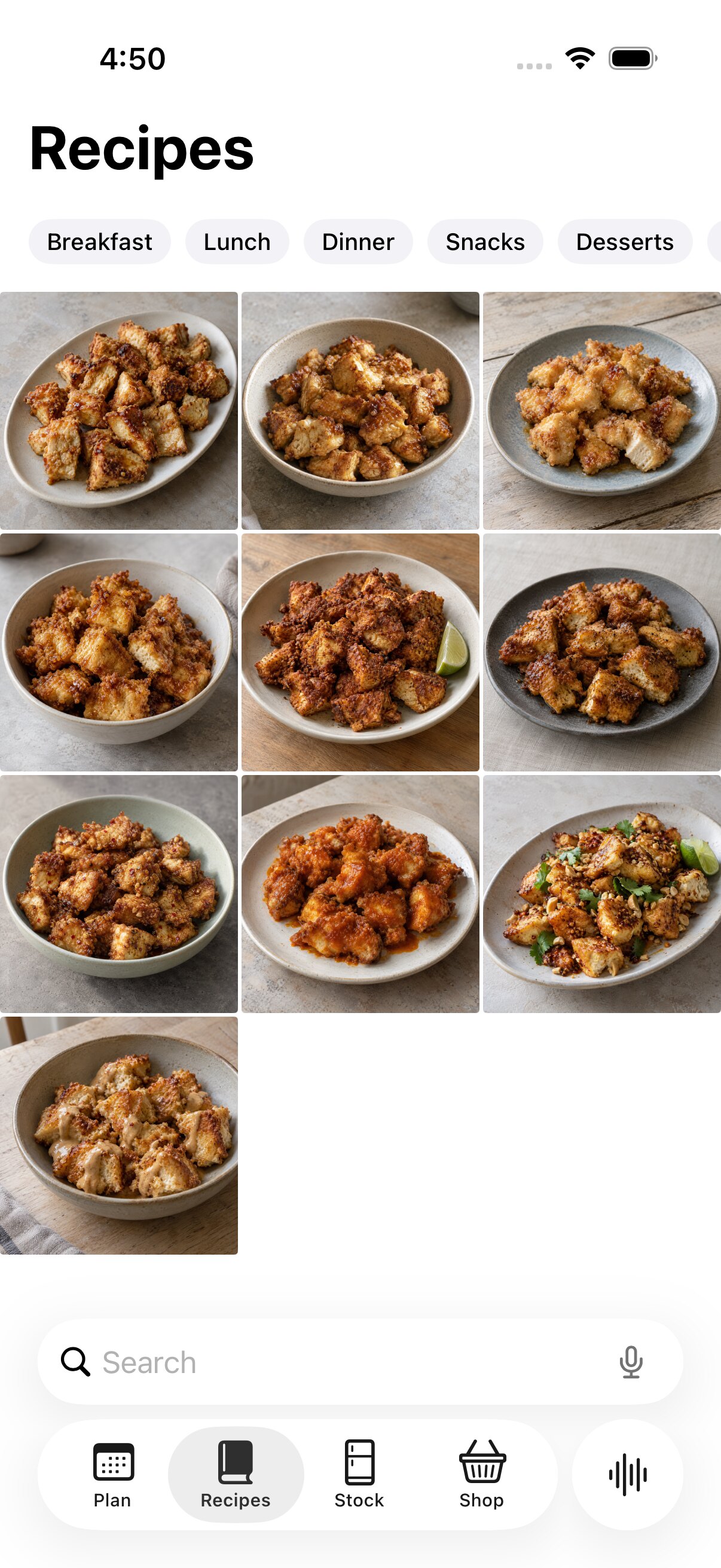
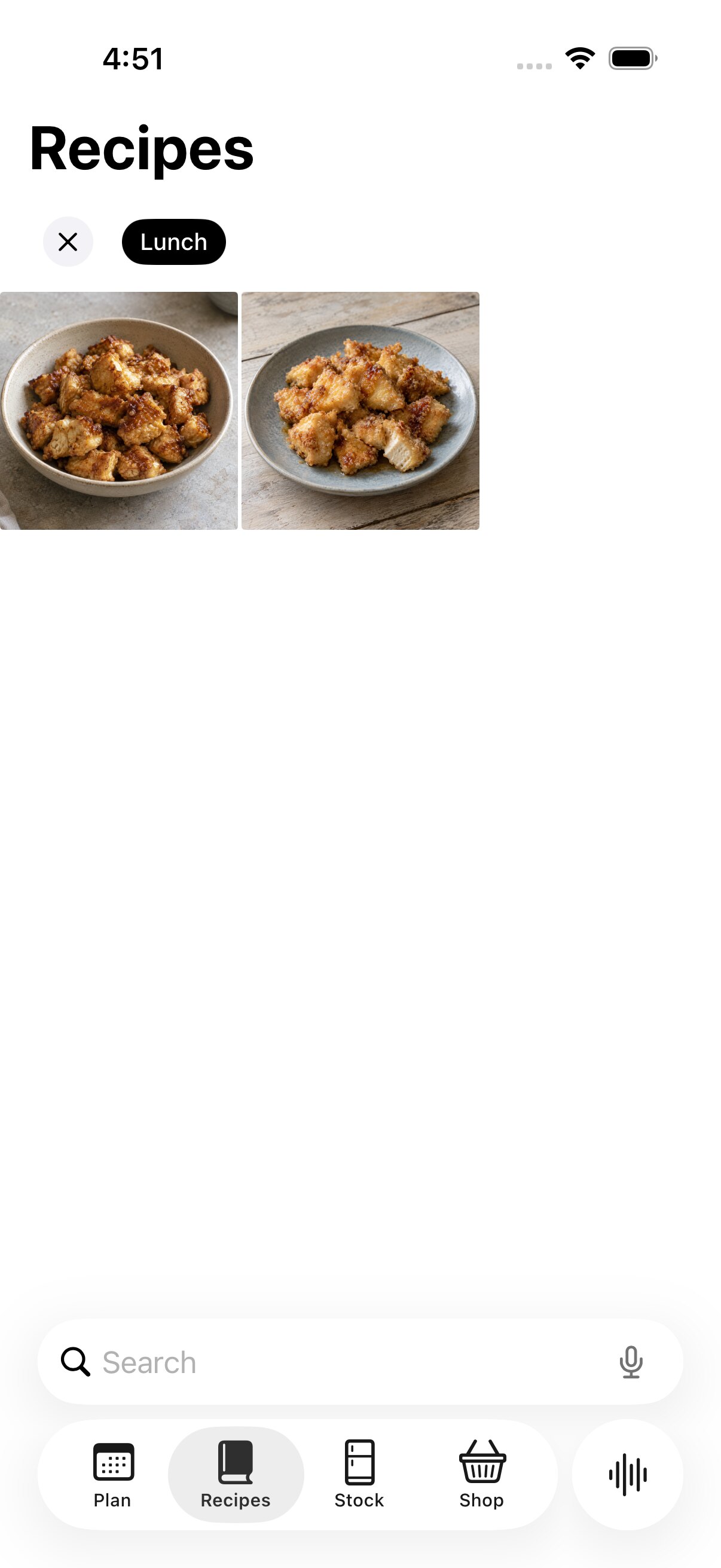
Simulator captures using test recipes.
Shop explains why an item stays
Swiping away a staple or a planned-meal ingredient now tells you why it can't go.
Shop is generated, so some rows are there for a reason: a staple is low or out, or a planned meal needs it. Swiping one of those to delete used to look like it might work. Now the delete action shows as unavailable, the row springs back, and a short note says why: this staple is out of stock, needed for a planned meal, or both.
Things I add by hand, like coffee filters, still swipe away normally. Household staples went live the same day, so toilet paper and dish soap can sit on the list with the groceries.
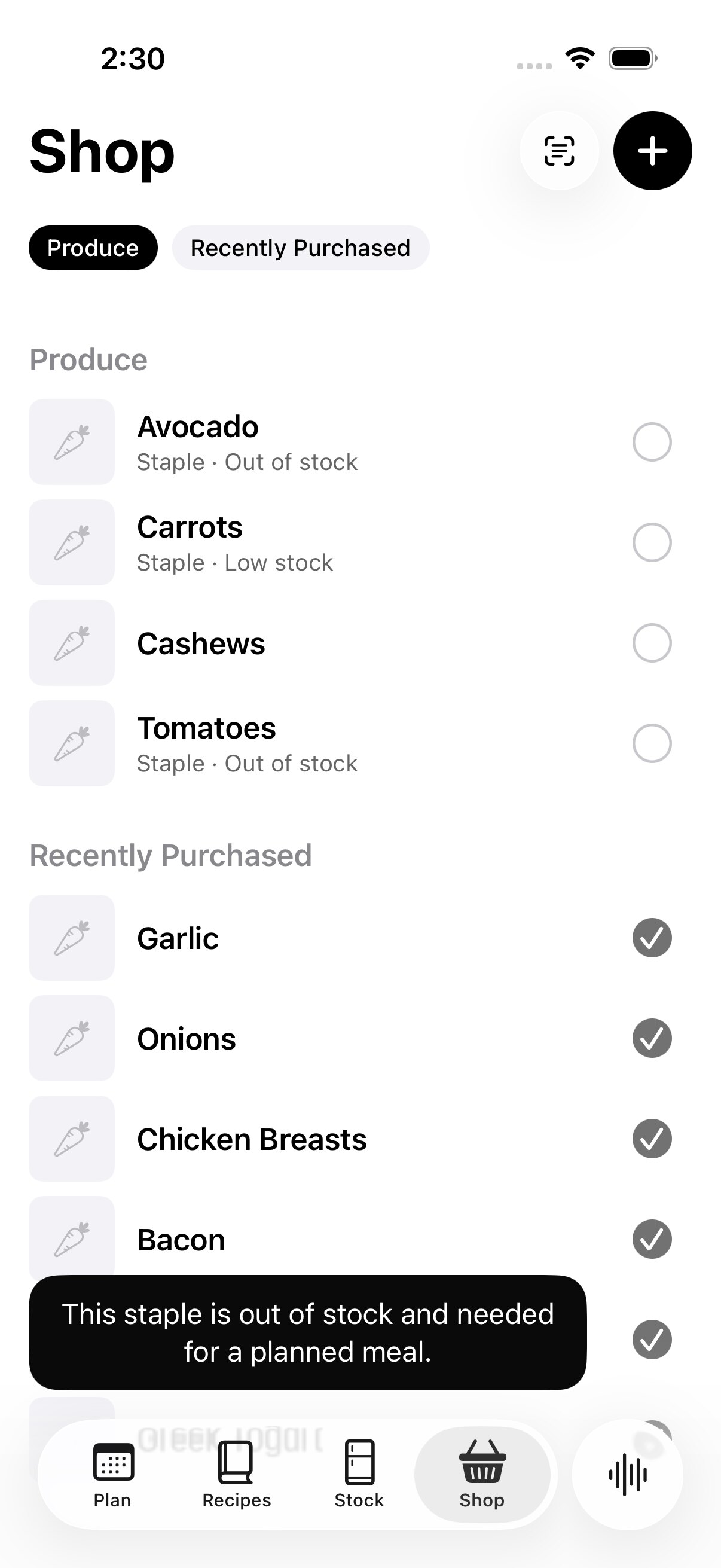
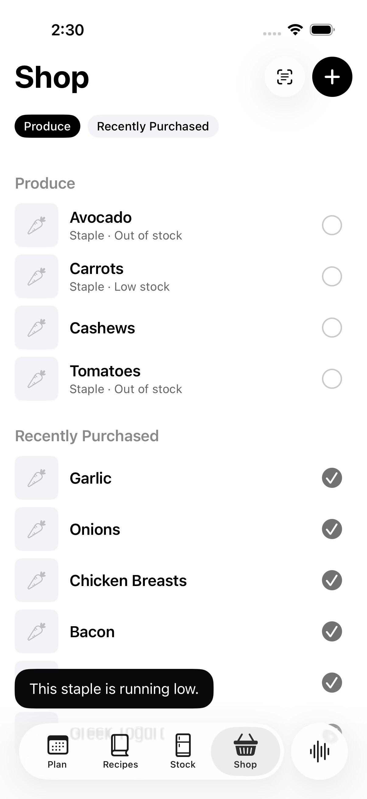
Simulator captures with sample shopping data.
Hiding the swipe entirely would have felt broken. Letting it run and then explaining keeps the gesture familiar while making the list's logic visible.
Equipment comes to the iPhone
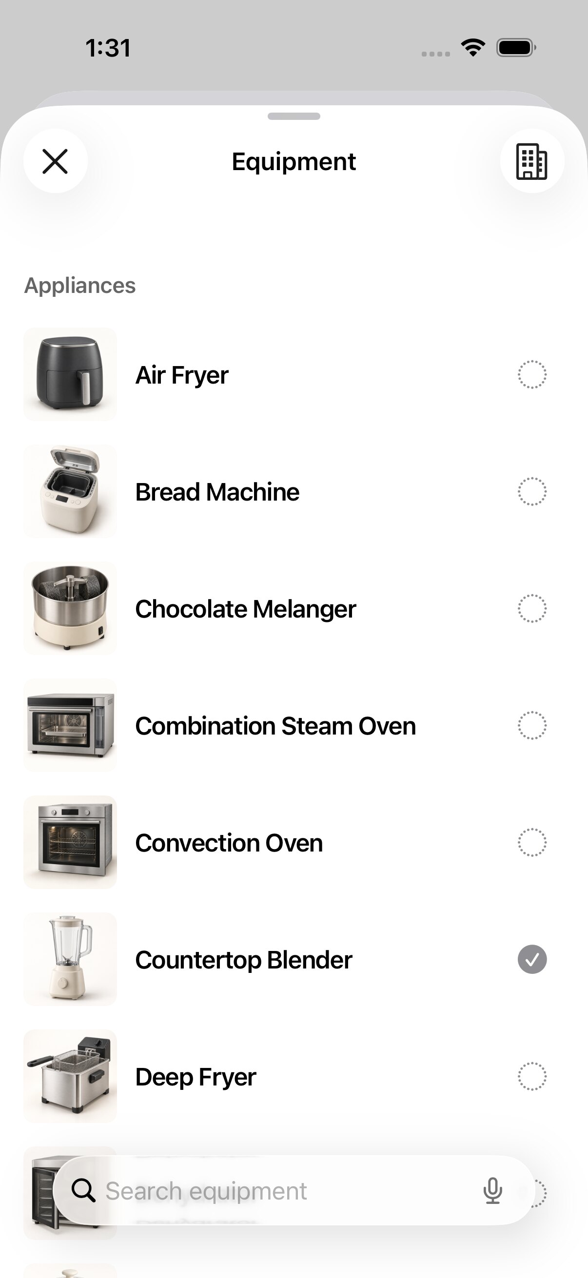
251 pictured pieces of kitchen equipment in 11 groups, so recipes can know what I can actually make.
Profile now opens Equipment: 251 pictured choices in 11 groups, with search and a simple on or off for each. Every kitchen starts with 54 sensible defaults, and changes stay with that location.
It matters because a recipe that needs a stand mixer is not a real suggestion in a kitchen without one. Equipment is the groundwork for recipes and the planner to respect what the kitchen can do.
Every open receipt in one list
Review Items gathers every receipt I haven't closed, sorted the way the kitchen is.
Review Items now shows every open receipt's lines together, under Needs Review, Added and Excluded. Rows run fridge, counter, pantry, freezer, then by food type, then soonest to spoil, so the order matches the shelves I am about to fill. Store chips narrow the list when more than one store is open.
Decisions are remembered. Excluding a line remembers that product for that store, so the next receipt from there excludes it on its own. The check at the top is final: matched lines are added, the receipt closes, and the list is empty until the next scan.
A later build of Review Items scrolling under its pinned heading, recorded in the simulator with sample receipts.
Every ingredient has a photo
724 live ingredients, 724 published photos, and new ingredients now make their own.
Catalogue growth had left 37 blank tiles in Stock. They now have distinct, reviewed photography, and production is back to 724 published images for 724 live ingredients, with all 2,181 image files hash-checked after publishing.
New ingredients no longer wait for me. Whether one arrives from a receipt, a stocktake or a recipe import, it saves immediately and a background workflow generates, checks and publishes its picture afterwards.
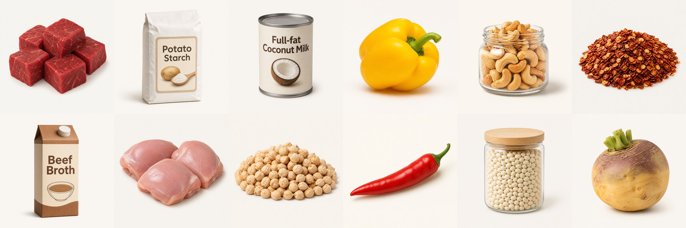
Ingredient photos from one of the catalogue's reviewed image batches.
Automatic image spend is deliberately narrow: one account only, attempts spaced at least 30 seconds apart, capped at six an hour and 20 a day, and a manually chosen image always beats an automatic one.