kitchenOS
My kitchen, kept honest: what's in it, what to cook, and what to buy next.
kitchenOS is a personal kitchen operating system I build for my own household. It keeps a living ledger of the food actually in the house, a recipe book I own, a meal plan, and a shopping list that writes itself from the gap between the two. It runs as a Next.js web app and a native SwiftUI iPhone app on the same Supabase backend.
It exists because every recipe app I tried treated my pantry as an afterthought. kitchenOS starts from the opposite end: one shared ingredient catalogue sits under everything, so the onion in a recipe, the onion on a receipt and the onion in the fridge are the same thing, with the same nutrition, shelf life and grocery aisle. Once that holds, planning and shopping become arithmetic instead of guesswork.
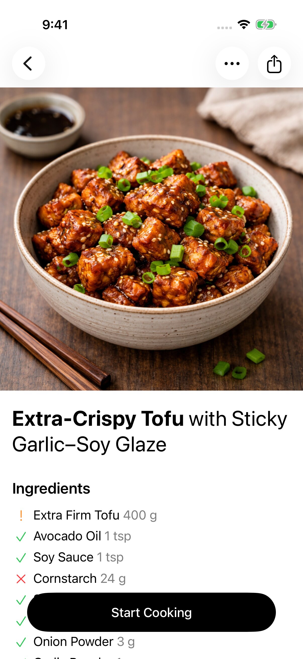
The whole product rests on one decision: ingredients live in a single shared catalogue. When I write Yellow Onion in a recipe and Onion lands in my pantry, the system knows they are related, because Yellow Onion is a variant hanging off Onion rather than a second row. By late August that catalogue held 724 live ingredients, each with macros, density, shelf life and a reviewed photo. A recipe can then mark each ingredient as in stock, low or missing at a glance, and Stock can show the house by aisle instead of as a flat list.
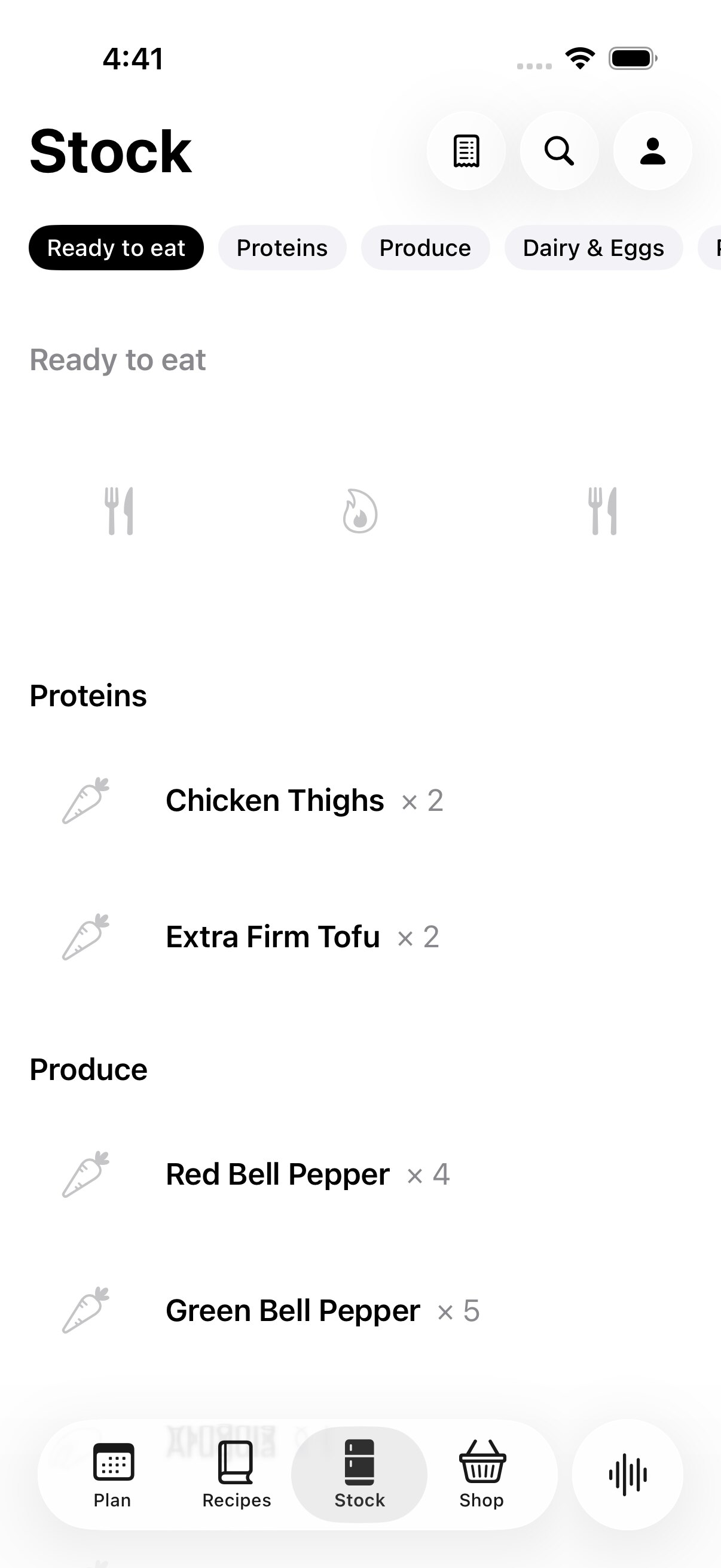
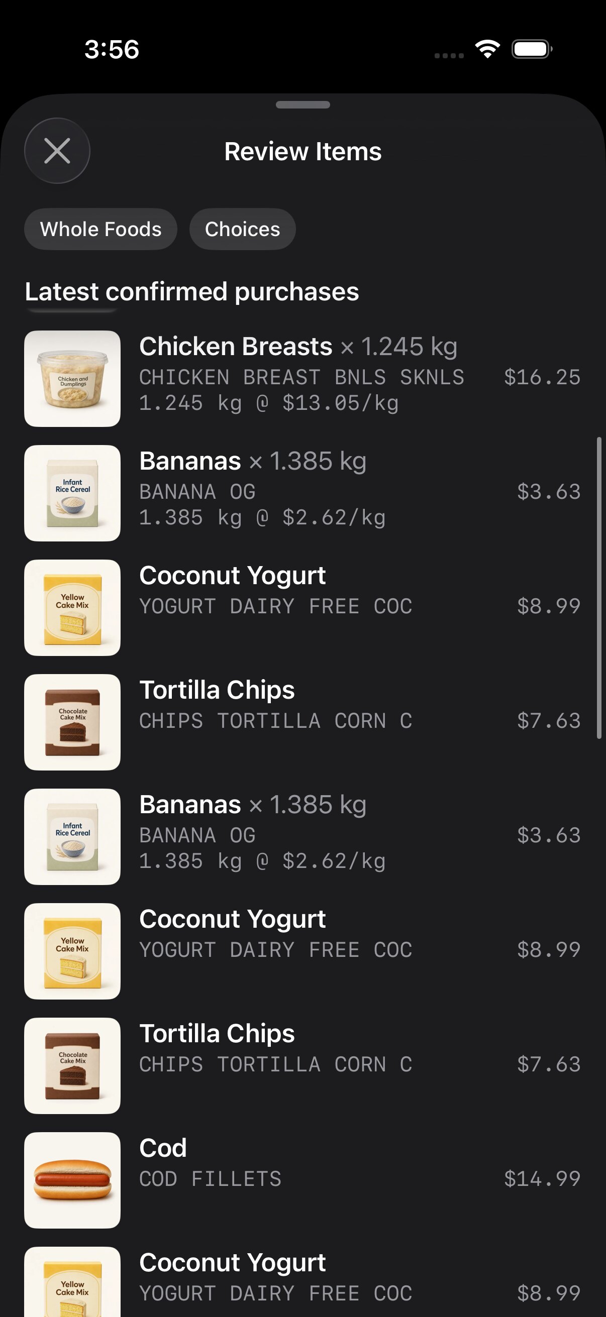
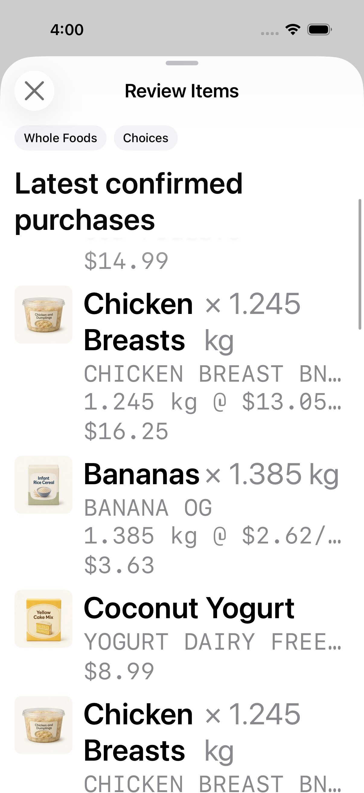
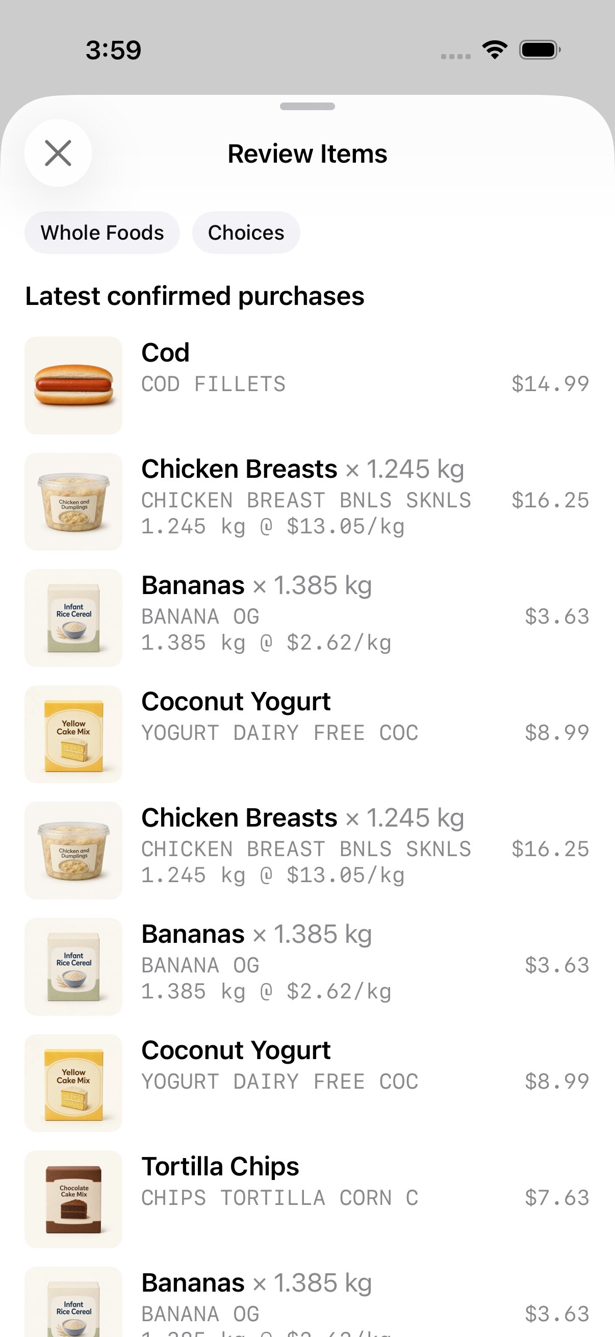
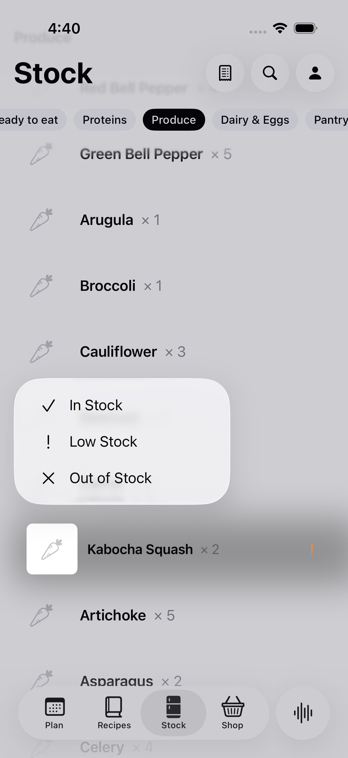
A stock ledger is only as good as its inputs, and nobody types in their groceries. So receipts are the main input. A scanned receipt arrives from ReceiptOS, my separate receipt app, and anything that matches a product I have confirmed before, or matches the catalogue exactly, goes straight into stock. Only new or genuinely ambiguous lines wait in Review Items, sorted the way the kitchen is: fridge, counter, pantry, freezer, then by food type and how soon it spoils. Stock itself stays deliberately coarse. A long press offers In Stock, Low Stock or Out of Stock, because pretending every gram was measured made the numbers lie.
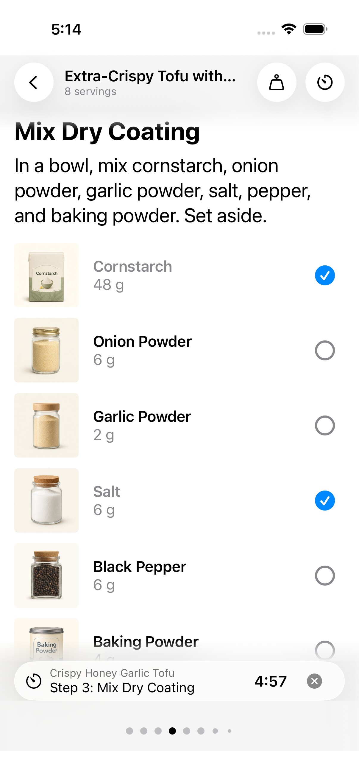
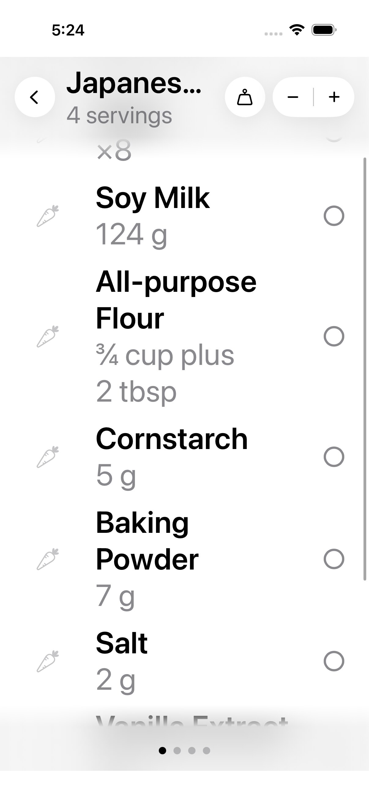
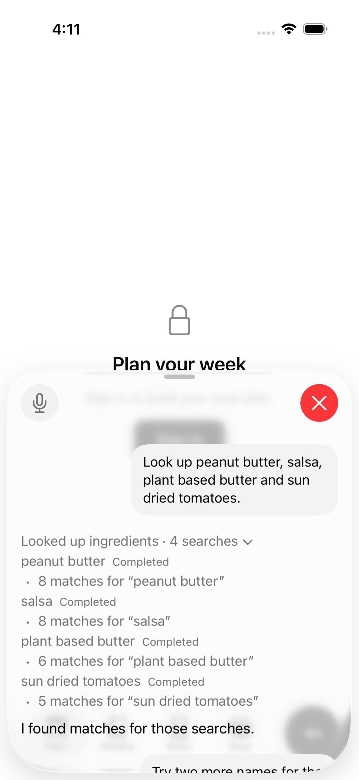
Cook Mode is designed for wet hands and a phone propped against the backsplash. Mise en place is step one: every ingredient for the current step is listed with its photo and amount and can be ticked off. Steps page horizontally, a timer rides along in the footer, and the layout holds up at the largest accessibility text sizes. There is also a voice assistant that can look things up in the kitchen and answer out loud, and it shows its work: each catalogue lookup it made, and which ones failed.
Plan is a strip of days with breakfast, lunch, snacks and dinner under each. It suggests meals from what is already in the house, won't put the same dish at the top of two meals on one day, and a pull-down refreshes the suggestions for every empty meal. Planned meals feed Shop, which lists only the difference between what the plan needs and what Stock holds, plus the household staples I always keep. Prepared food counts too: leftovers reserved against a planned meal satisfy it before Shop asks for raw ingredients.
I don't write the code myself. I direct AI coding agents, mostly Codex and Claude, against a living PRD, a changelog written for people, and a Linear backlog. Since January the repo has gathered about 1,290 commits, 121 database migrations and more than 40 Internal TestFlight builds. Every ticket ends with evidence I can judge as a designer: unedited simulator captures in light, dark and larger text, a recording of the real interaction, and test counts (532 package tests and 224 app tests on the iPhone side, around 3,000 on the web). I review the captures; the agents prove the rest.